D I G I T A L 3 6 0

Hello There!

Lorem ipsum dolor sit amet, consectetur adipiscing elit,

Drive meaningful growth and innovation with our professional AI solutions designed to make your business smarter & faster.

Corporate

Industry

2026

Created

Deliverable

Full website redesign + CMS

A site built to attract serious capital.

Talos Holdings needed a digital presence that matched their track record. We rebuilt it from the ground up, focused on investor trust, deal credibility, and converting the right audience.

The Problem

A strong company with a weak first impression.

Talos Holdings had the portfolio, the team, and nearly three decades of proven execution in Class A multifamily development. What they didn’t have was a website that reflected any of it. The site was underperforming in every way that matters when you’re raising capital and attracting venture partners.

The previous experience felt dated, difficult to navigate, and gave serious investors no clear reason to stay. Worse, it buried the very proof points that should have been front and center.

  • Slow load times
  • No clear investor journey
  • Generic visual design
  • Poor mobile experience
  • Weak content hierarchy
  • No CMS flexibility
— Friction Points Identified
01
No defined investor pathway
The site treated all visitors the same. Venture partners had no clear starting point, no credibility signal, and no obvious next step.
02
Projects buried in navigation
Featured deals like The One and The View were hard to find. The portfolio, Talos’s biggest proof of concept, was completely undersold.
03
Visual identity didn’t match the market position
Talos competes in the premium multifamily space. The design communicated nothing close to that. Trust signals were absent.
04
Performance issues across devices
Page load times were averaging 4.2 seconds on mobile. For a high-net-worth audience, that’s a conversion killer.
Our Strategy

Position first. Design second.

Before we touched a single wireframe, we spent time understanding who Talos actually talks to. The primary audience isn’t renters, it’s venture partners evaluating a long-term capital relationship. That insight changed everything.

We restructured the entire site architecture around two journeys: the investor exploring opportunity, and the prospective resident looking for their next home. Both mattered. Neither was being served.

The positioning work clarified Talos’s real differentiators: decades of execution, Class A quality without Class A price points, and a genuine track record of partner returns. Those became the pillars every design decision had to support.

We paired that with a tone shift: out with the corporate boilerplate, in with the kind of confident, direct voice that high-net-worth investors actually respond to.

Pillar 01

Investor-First Architecture

Rebuilt the information hierarchy so venture partner opportunities surface immediately. Clear CTAs, trust signals above the fold, and a deal pipeline page that actually communicates momentum.

Pillar 02

Portfolio as the Hero

The One, The View, The Retreat, The Residence. These aren’t footnotes. We repositioned the project portfolio as the centerpiece credibility story, with rich property pages for each development.

Pillar 03

Brand Elevation

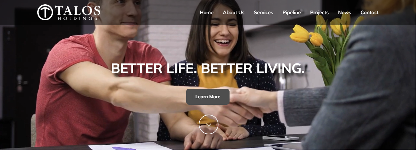
A refined visual identity system aligned with the premium end of real estate development. Dark, architectural, confident. The kind of design that signals substance before a single word is read.

Execution

Twelve weeks. No shortcuts.

We ran a tight, iterative process across discovery, design, and build. Every stakeholder touchpoint was intentional, and we kept the team focused on the deliverable that actually mattered: a site that closes.

01
Discovery & Audience Research
Stakeholder interviews with the Talos leadership team. Competitive audit of 12 real estate investment firms. Heuristic review of the existing site. Defined two primary user journeys and five key conversion moments.
Stakeholder Interviews
Competitive Audit
User Journey Mapping
02
Information Architecture & Content Strategy
Restructured the sitemap from 8 loosely connected pages to a tight, goal-oriented experience. Wrote new copy for every key section, distilling Talos’s 30-year story into scannable, credibility-forward content.
Sitemap Design
Copywriting
Content Hierarchy
03
UX Wireframing & Prototyping
High-fidelity wireframes for all 14 page templates. Prototyped key flows including the venture partner inquiry funnel and the project portfolio browsing experience. Two rounds of client feedback, zero scope creep.
Figma
Prototype Testing
Client Reviews
04
Visual Design System
Built a complete design system from scratch. Defined typography scale, color tokens, spacing, component library, and photography art direction guidelines. All components documented and handed off for long-term maintainability.
Design System
Component Library
Brand Alignment
05
Development & CMS Build
Custom WordPress build with a fully flexible page builder, optimized media delivery, and structured content types for the projects pipeline and news feed. Performance-first development with lazy loading, image optimization, and Core Web Vitals compliance on all templates.
WordPress
Core Web Vitals
Performance Optimization
Custom CMS
06
QA, Launch & Handoff
Full cross-browser and device QA across 24 configurations. SEO migration including 301 redirects, structured data, and metadata optimization. Live team training session and a detailed CMS documentation guide delivered on launch day.
QA Testing
SEO Migration
Team Training
Before & After

What actually changed.

Before
  • Homepage led with generic company copy, no clear value proposition
  • Investor opportunity buried three levels deep in navigation
  • Project portfolio displayed as a basic image gallery with no deal context
  • 4.2 second average mobile load time across key pages
  • No structured content types: blog, projects, and news all manually hardcoded
  • Contact form as the only conversion path; no segmentation by audience type
  • Inconsistent typography, no visual hierarchy, heavy use of stock imagery
  • Zero structured data; limited organic search visibility
After
  • Outcome-focused hero with an immediate value proposition for venture partners
  • Dedicated venture partner section surfaced in the primary navigation
  • Rich project pages with deal specifics, location context, and visual depth
  • 1.3 second average mobile load time, fully Core Web Vitals compliant
  • Fully headless CMS with custom content types, manageable by any team member
  • Separate conversion funnels for investors and residents, each with relevant CTAs
  • Cohesive design system with premium editorial typography and custom photography guidelines
  • Full structured data implementation and on-page SEO across all 14 templates
The Results

Numbers that matter.

We tracked performance across four key dimensions in the 90 days post-launch: investor engagement, content depth, organic search, and technical performance. Every metric moved.

3.4x
Qualified investor inquiries via the venture partner funnel
+240% vs prior quarter
+68%
Average session duration across all page types
2:14 min avg previously
1.3s
Mobile page load time, down from 4.2 seconds
69% faster
+52%
Organic visibility growth for target RE keywords
6 months post-launch
-41%
Bounce rate reduction on the homepage and services pages
74% down to 43%
100
Google PageSpeed score on desktop across all templates
From an avg of 58

“We always knew our track record was strong. We just needed a site that actually showed it. Within two months of launch, we were closing conversations that used to stall at the first impression.”

Jacques Bazinet, COO — Talos Holdings

Ready for your own?

Your site should
work as hard as you do.

If you’re a firm that’s outgrown its digital presence, we’d like to talk. No pitch decks, no retainer proposals on a first call.